Increasing customer conversions on your website through UX
You have a website, and you have successfully set up your marketing funnels through social media and email marketing, which is driving users to your desired landing pages. But what’s next? You’re not converting as well as you envisaged, your site’s bounce rate is too high – why is this happening?
Companies that have a structured and strategic approach to their landing pages and marketing messages are twice as likely to convert sales. You have roughly 3 seconds for your visitor to decide if your website is right for them. So, is your landing page delivering what you promised through your funnel? Are you bombarding them with too much content and scaring off your potential customers? Here’s how you turn your potential prospects into paying and loyal customers…
Boost your Call to Action with Click Triggers
If your prospects have decided to purchase your goods and/or service, you don’t want confusing Call To Action (CTA) buttons to interfere with their purchase or steer them away from your site. Customers need to know what will happen when they click a CTA, or they won’t click. Microcopy removes the uncertainty your users may have with completing an action, think of microcopy as instructions to your site, they need to know how to use your site and what happens when they click a CTA button. Remember, you only have a small window to convert your potential customers, so ensure their experience is straightforward and remove any friction points.
Security is Key
All customers get slightly cautious by purchasing online, especially if this is their first time purchasing on your site. What payment gateways are you using? Are they trusted and secure?
PayPal and Stripe are great payment gateways to integrate into your website. People have existing brand trust with PayPal and Stripe has gained traction over the last few years also, therefore your visitors will be more likely to follow through with a purchase through these trusted suppliers.
Boast about your privacy policy and disclaimer, don’t just have it in the fine print, your goal is to make your potential customers feel secure. Preview the SSL badge and a lock icon with your ‘BUY NOW’ buttons, this will aid in creating a secure purchasing experience and is a great way of converting more sales.
Less is More
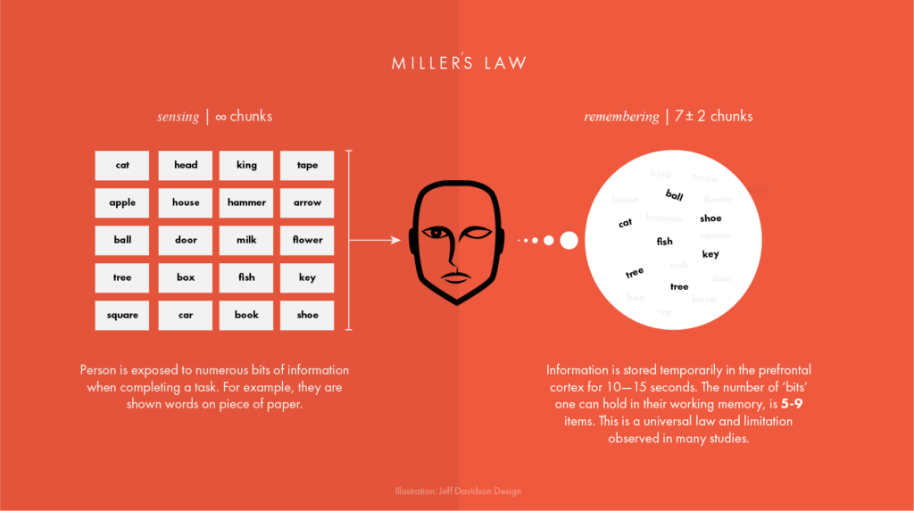
If we apply Miller’s Law to design, “The observation that the number of objects an average person can hold in working memory is about seven” elements of information should be organised in groups of 7 +/- 2 items, ideally in chunks of 5.


If your homepage has too many CTA’s, your conversion rate will be negatively impacted. Consider every prospect that reaches your landing page is lazy, they need to be told what to do, with only a few key CTA’s, microcopy and copy. Your website’s UX is responsible for directing the entrance and exit of each prospect.
A/B Testing
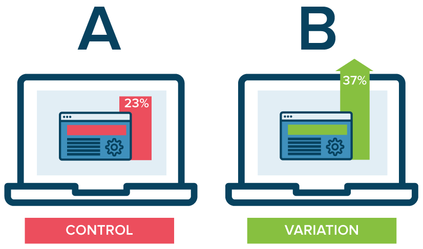
A/B testing is a great strategy to adopt when designing your website’s landing pages. However, it’s important to know what you’re testing, and why. Consider A/B testing different marketing messages, CTA’s, supporting imagery etc. Measure and compare the results of the A/B tests to better understand what messaging your prospect’s respond to. A/B testing your websites landing pages will ensure your website is converting as high as possible.


Understanding your End Users Journey
It’s important to understand your customer’s journey inside and out. Think like your potential customer, having landed on your site after clicking through a funnel. What should they expect to see? Where are they being directed? Understanding your customer journey will aid you in removing pain points, making your customers journey an enjoyable experience. Great UX will drive your brand to convert sales on your landing pages.
UX is not your only Touch Point
UX is just one factor of your website and overall brand experience. You also should consider a strong Brand Identity, strong attractive UI, and last but not least – your Customer Experience (CX). The User Experience needs to be seamless throughout your marketing, including in-store sales, email, social media profiles, phone calls and so on. The goal is to build a consistent CX. Every touch point to your brand should be consistent, right down to the marketing messages and CTA’s.
By implementing the above key strategies into your website’s landing pages, you can expect to see an increase in customer conversions. Be mindful, the increase in conversions is not going to happen overnight. Ensure your marketing funnel is consistent, test different marketing messages, CTA’s, and key elements of information to identify what your customers respond to. Eventually, this will create a consistent Brand Customer Experience and will increase customer loyalty – which ultimately means more sales.


