The Style Guide: Crafting Consistency
Embarking on branding your new business venture or rebranding your existing business can be an exciting journey. You might come across the term “style guide” along the branding journey and wonder about its significance. Let’s delve into why a style guide is important and how it helps to craft a consistent and compelling visual identity for your brand and business.
What is a Style Guide, Anyway?
Forbes refers to a style guide as “an essential tool for establishing brand identity”. A style guide is a comprehensive document outlining the guidelines and standards for your brand and how to create and implement design elements across different mediums. In the world of graphic design, the style guide dictates and defines a brand’s visual elements and design principles, providing a clear framework for maintaining a unified brand identity. A style guide becomes the roadmap to visual harmony. It creates a cohesive and recognisable style across all your brand touch points by ensuring consistency in typography, colour palette, imagery, layout, and other design elements.


Creating a Design Style Guide: Key Points to Consider
1. Define the Brand Identity: Get to Know Your Brand
Begin by understanding your brand’s personality, values, target audience, and positioning in the market. These factors play a crucial role in shaping the design style and tone of voice that will resonate with your audience.
2. Establish Design Elements: Building Blocks of Visual Identity
Identify and establish key design elements such as logos, typography, colour palette, imagery styles, iconography, and layout grids. Clearly define guidelines for their usage, proportions, spacing, and variations to ensure consistency across all platforms.
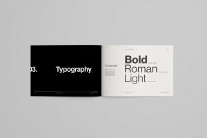
3. Typography: Words That Speak Volumes
Choose suitable fonts for headings, subheadings, body text, and other typographic elements. Define the point size, weights, and spacing to maintain a consistent style throughout your brand materials.
4. Establish a Colour Palette: Colours That Speak Your Brand’s Language
Select primary and secondary colours that represent your brand. A well-defined colour palette typically includes 2 to 6 colours. Specify their colour codes (RGB, CMYK, or HEX) for print and digital applications to maintain consistency and accessibility. To learn more about the psychology behind colours and branding, check out our blog on Colour Psychology and Branding Your Business.
5. Outline Imagery Guidelines: Visual Storytelling
Determine the style and types of imagery that align with your brand’s visual identity. Provide guidelines for image selection, cropping, filters, and overall image treatment to ensure your visuals consistently convey your brand’s essence.
6. Define Layout Guidelines: Structure and Harmony
Define layout grids, margins, and spacing for different design materials such as brochures, websites, social media posts, and more. Include examples and instructions for maintaining visual balance and hierarchy, ensuring your designs are cohesive and visually pleasing.
7. Include Usage Examples: Bringing It All Together
Showcase real-life examples of how the design elements should be implemented across various mediums, such as stationery, signage, advertisements, and more.
Ready to take your brand to the next level and create an unforgettable visual experience? We’re here to make it happen! Our team is passionate about helping businesses like yours establish a unique and engaging visual identity. We’re passionate about bringing your design goals to life and creating a brand experience that resonates with your target audience. Get in touch with us today, and together let’s create something great.


