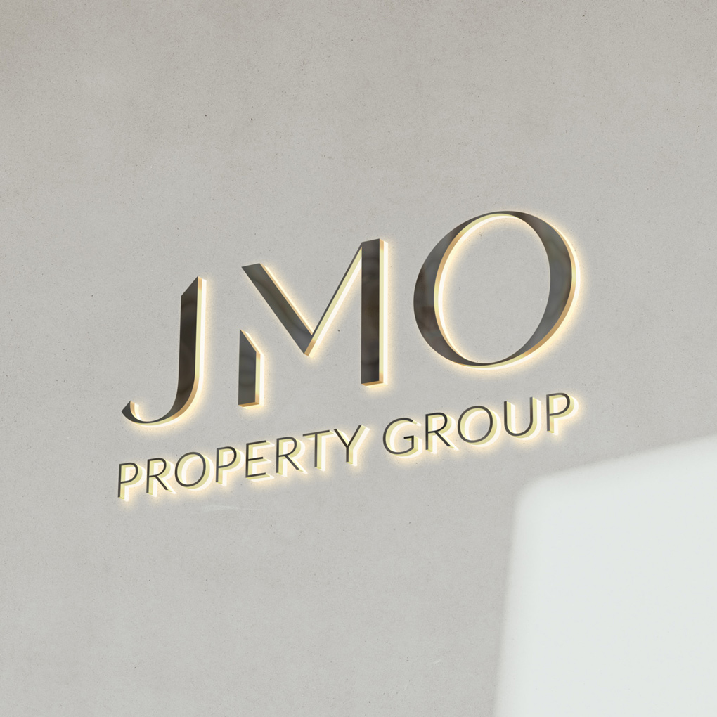
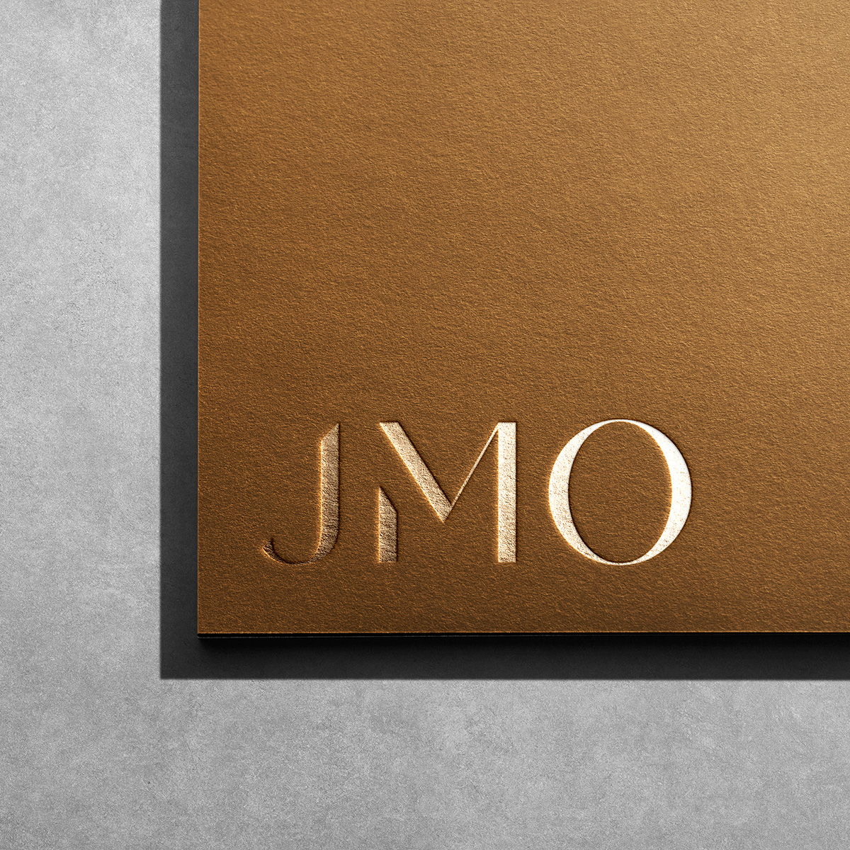
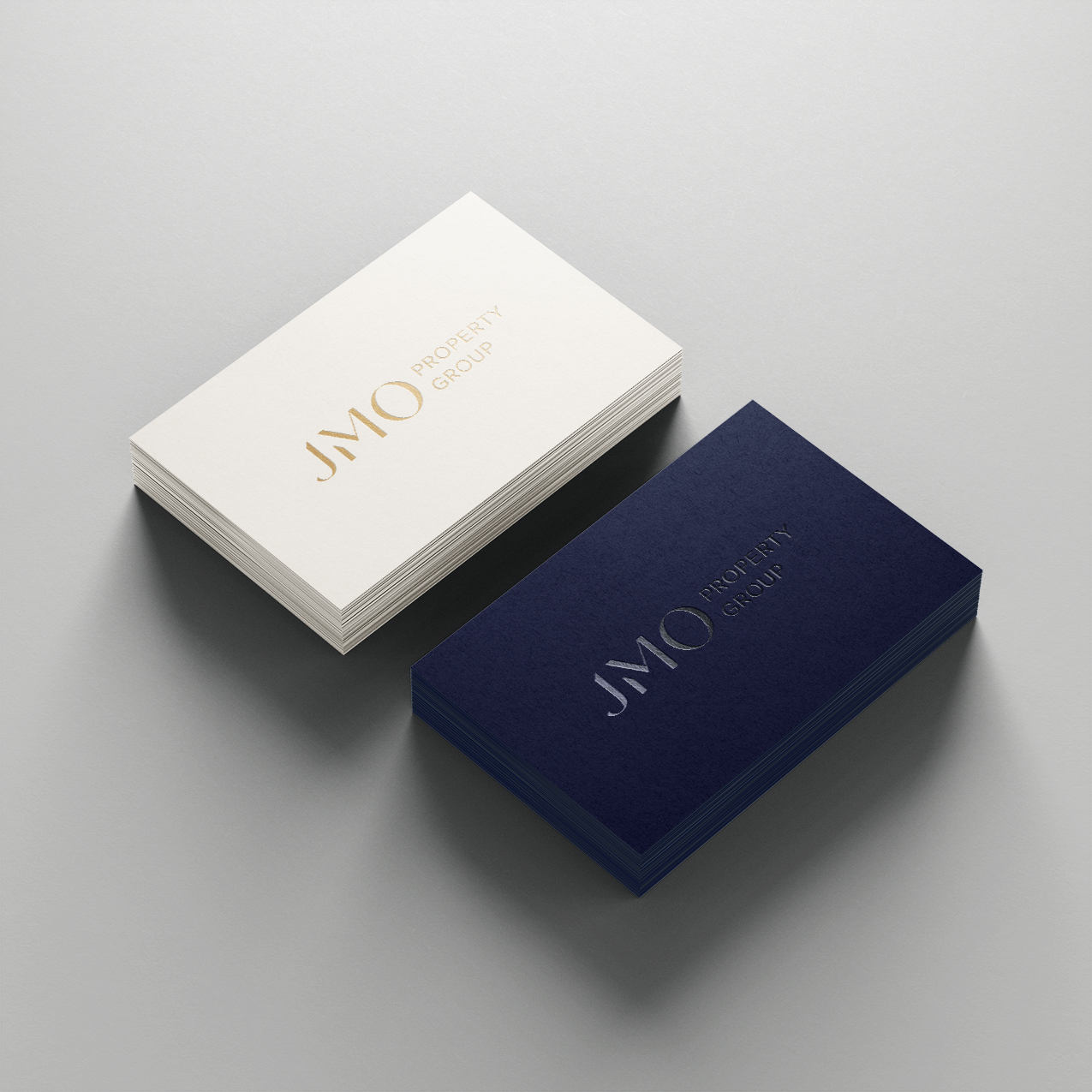
For the logo, we designed a bespoke letter mark, which we paired with a classic sans-serif font to create an elegant and confident brand identity. To reinforce JMO’s brand positioning, we utilised a colour palette of dark blue with gold accents to represent trust, affluence and success. We then designed a prestige suite of marketing collateral based on JMO’s updated visual identity. For all of the stationary items, we kept the designs simple, refined and beautiful.
As part of the project, we refreshed JMO’s website UI to align with the new branding. As a key touchpoint for new and existing clients, it was important that their website not only provides a seamless user experience but also represents the company’s position in the luxury real estate market. The updated design is refined, intuitive and optimised for showcasing prestigious properties.